May 19 2016
Visualize Whirled Peas
Keeping with the food them from my prior blog post, I present to you: 40 Maps That Explain Food in America. In fact, it was this article that lead me to the Waffle House article to begin with.
The 40 maps use a variety of visualization techniques to show different food-related subjects. For example, what’s the most typical barbecue in Texas? It would appear to be brisket. Do you drink Soda? or Pop? Or that red drink? (I’m not allowed to type out the name…) How far are you from a McDonalds?
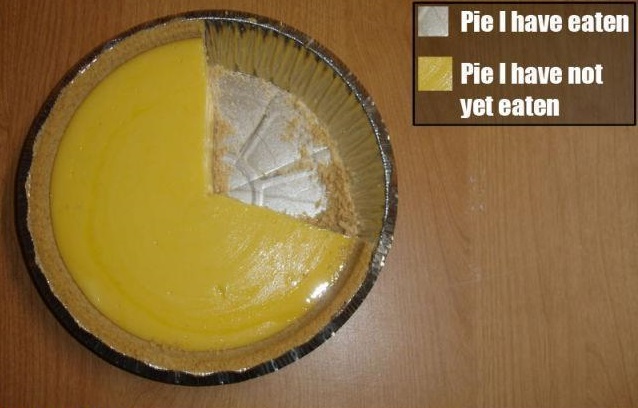
There are some predictable visualizations including color-coded maps, line charts, bar charts, and of course even a pie.
Mmmmm, pie.

Comments Off on Visualize Whirled Peas
